%matplotlib inline
#%matplotlib qt
# Mi ricreo l'istogramma con i bin desiderati (ora quello sorpa)
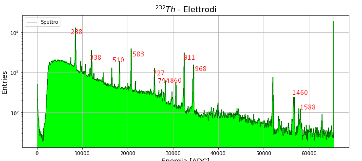
h, bins = np.histogram(myData["qlong"], bins = 1000)
binc = bins[:-1] + (bins[1] - bins[0])/2
# Definisco l'intervallo in cui cercare il max per una rapida calibrazione
intervalli = ((7700, 9000), (11300, 12400), (17500, 19260), (19260, 21430), (25000, 26460),
(27960, 28840), (30000, 31430), (31430, 33330), (33330, 35910), (51679, 52277))
energieVere = np.array((238, 338, 510, 583, 727, 794, 860, 911, 968, 1460))
def myGauss(x,a,mu,sigma,m,q):
return a*np.exp(-(x-mu)**2 / (2*sigma**2)) + m*x+q
# Plotto spettro e picchi
fig, ax = plt.subplots()
fig.set_size_inches(12,5)
ax.plot(binc, h, ds = "steps-mid", c = "darkgreen", lw = 1, label = "Spettro")
ax.fill_between(binc, h, step = "mid", color = "lime", alpha = 1)
xmax1 = []
for i in intervalli:
tmpCond = (binc >= i[0]) & (binc <= i[1])
tmpXdata = binc[tmpCond]
tmpYdata = h[tmpCond]
# Indice del max sui sotto vettori appena costruiti
tmpIdx = np.argmax(tmpYdata)
xmax = tmpXdata[tmpIdx]
ymax = tmpYdata[tmpIdx]
# fitto
popt, pcov = curve_fit(myGauss, tmpXdata, tmpYdata,
sigma = np.sqrt(tmpXdata), absolute_sigma = True,
p0 = (ymax, xmax, 50, -.03, 2000))
#print(popt)
ax.plot(tmpXdata, myGauss(tmpXdata, *popt), ":k")
xmax1.append(popt[1])
ax.grid()
ax.set_xlabel("Energia [ADC]", fontsize = 14)
ax.set_ylabel("Entries", fontsize = 14)
ax.set_title("$^{232}Th$ - Elettrodi", fontsize = 16)
ax.legend()
ax.set_yscale("log")
ax.set_ylim((20, 1e4))
plt.show()
xmax1 = np.array(xmax1)